Physical Address
304 North Cardinal St.
Dorchester Center, MA 02124


Physical Address
304 North Cardinal St.
Dorchester Center, MA 02124


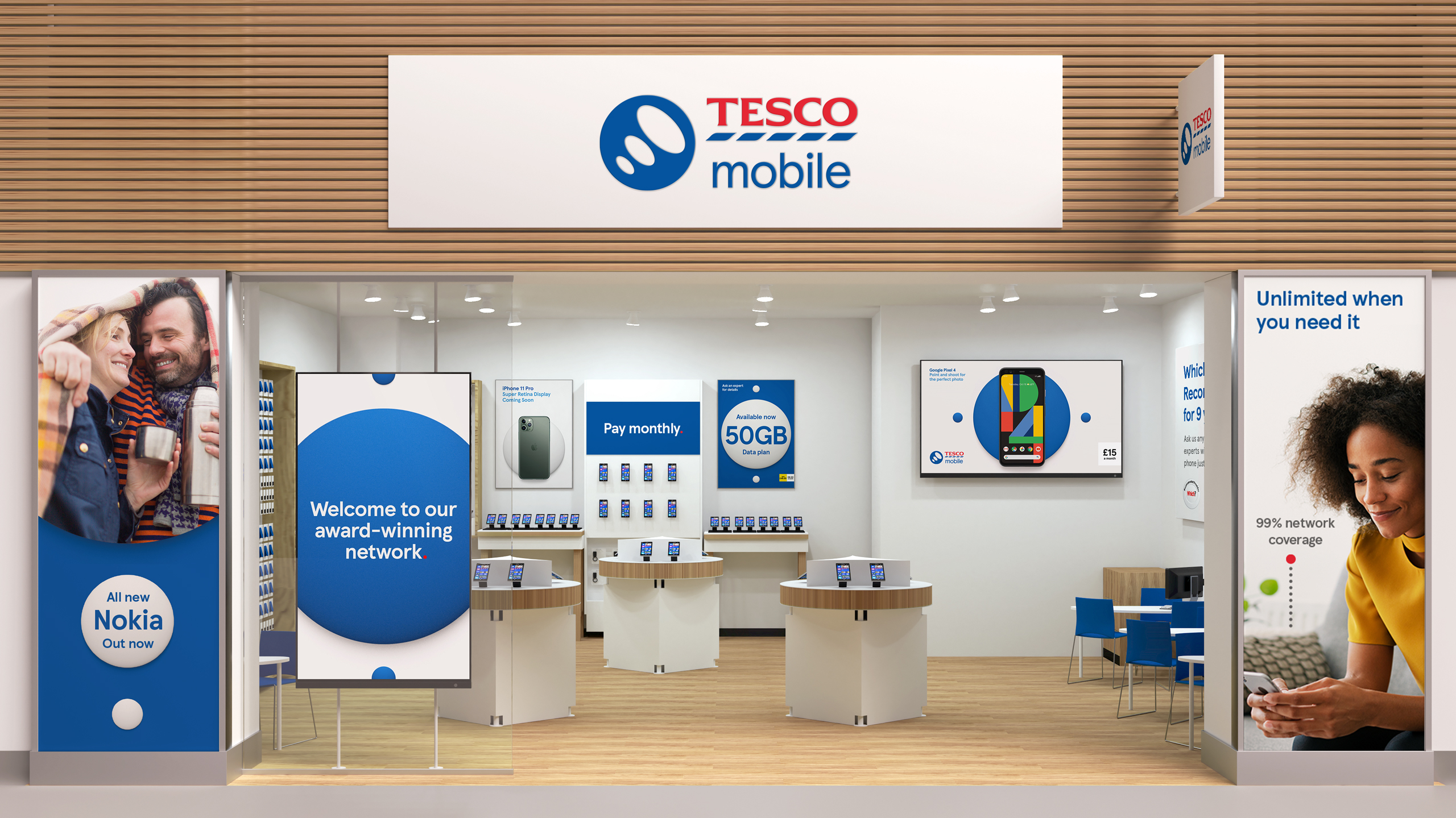
Tesco Mobile has unveiled a new brand identity and logo that it says aligns it more closely with its wider Tesco.
The MVNO’s refreshed logo updates the colours to red and blue, and flips Tesco’s pulse logo upside down to symbolise signal connectivity.
Tesco Mobile CMO Rachel Swift said: “From research we know the changes we’ve made have had a positive impact on how our brand is perceived, with more people than ever saying our new look and feels signposts quality and expertise. We’re proud to share our brand redesign, which takes us on to the next chapter of the Tesco Mobile story. Our new identity embodies our values and visually reinforces our position as part of the Tesco family.”
The brand refresh is the latest of a series of new initiatives under new CEO Tom Denyard, following from its sustainable packaging partnership with Juice and its new Clubcard Plus offerings.
According to recent Ofcom data, Tesco Mobile recorded the lowest volume of pay-monthly mobile-related complaints in the first quarter of 2020.